CLIENT
Yükaan
PROJECT
Product Development and Identity Work
ROLE
Creative Direction
Art Direction
Graphic Design
Writing
Branding
Marketing
An entrepreneur had an idea: Rent bins to people who are moving as a sustainable alternative to cardboard boxes. His initial idea was to rent multi-colored bins to help keep belongings organized and make packing and unpacking faster and easier.
After researching his audience and his competition, it became clear that the type of moving container was not the biggest pain point, but the stress of moving. This drove the rest of the solution.
The name “Yükaan” echoes the phrase “You Can.” Its unique spelling is evocative of a Scandinavian word, evoking the clean design and organizational excellence of that rich cultural heritage.
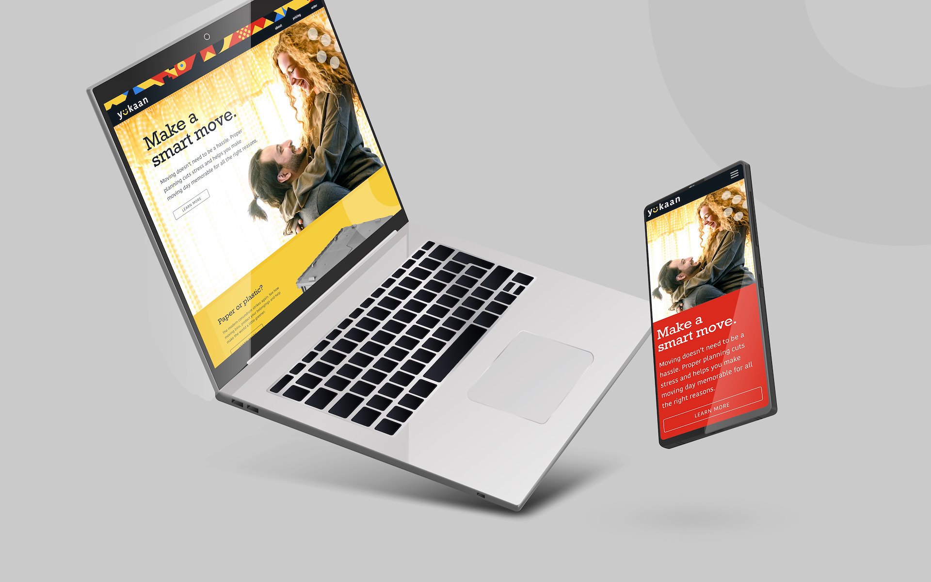
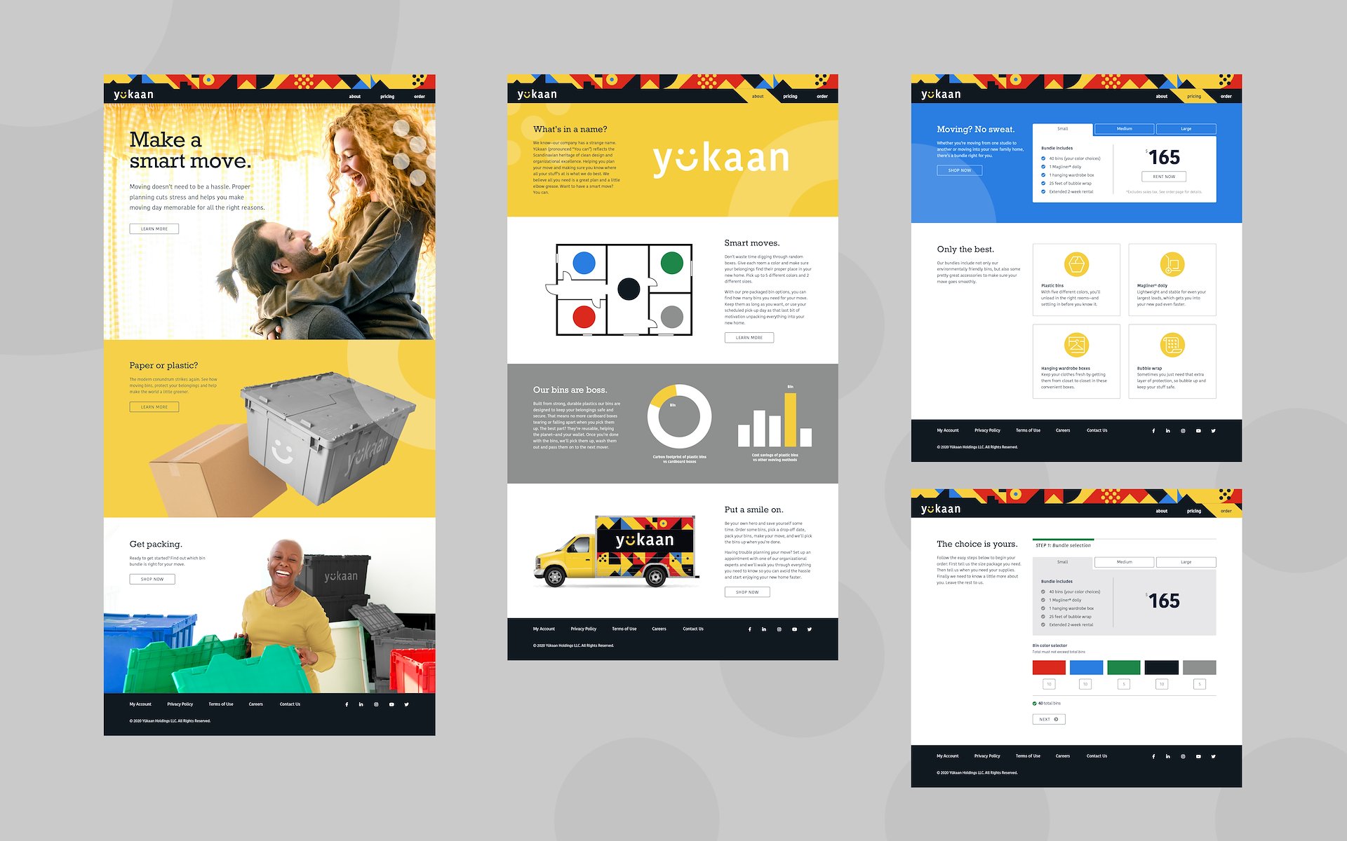
The website initially focused on bin rental, with the voice of the brand conveying confidence to customers that they could “Make a smart move.” However, the long-term goal was to continue to extend the brand touch points to position Yükaan as a trusted moving advisor.

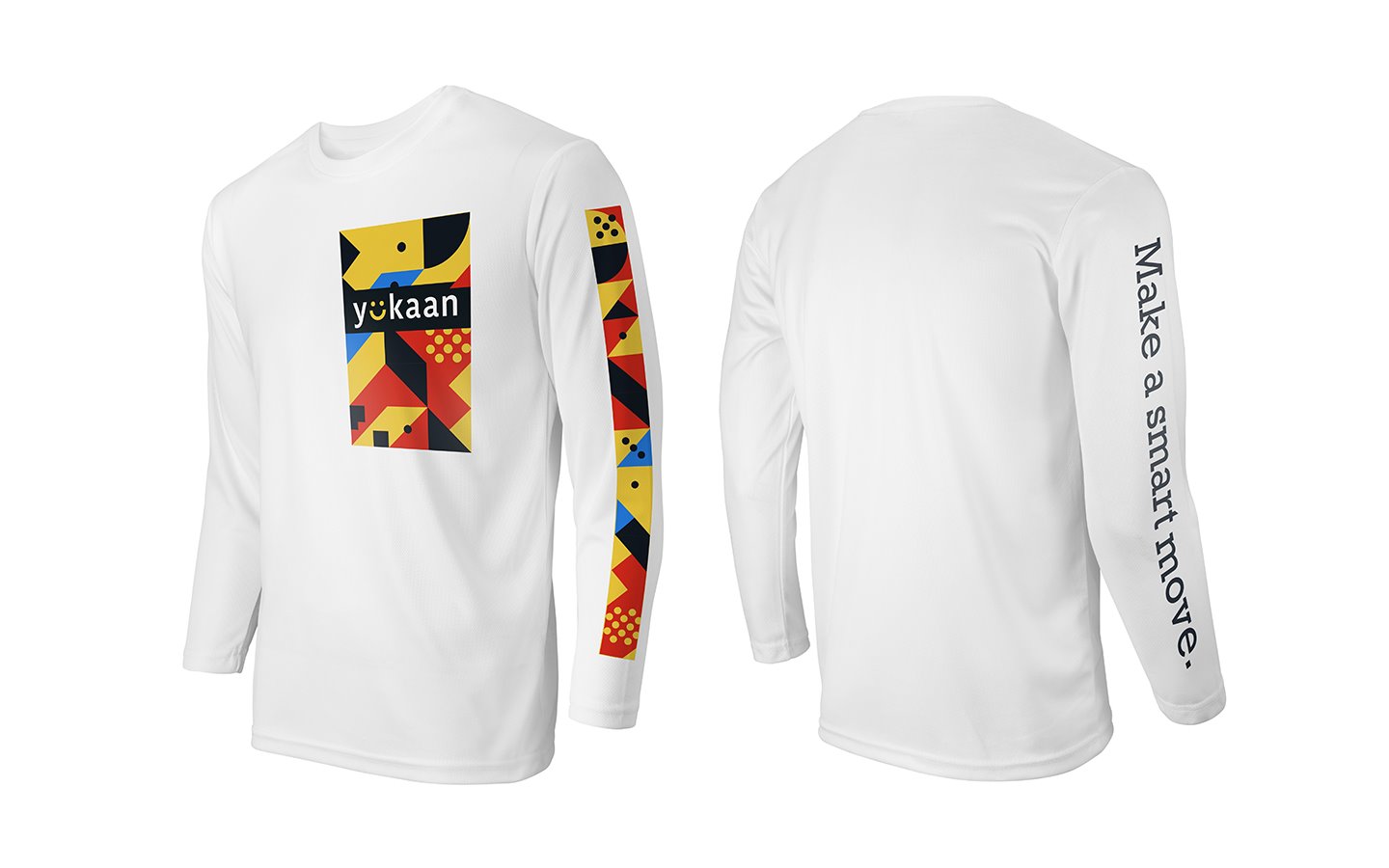
Since it was important that the bin-delivery drivers looked casual and stress free, the “Yüniform” was created, consisting of jeans and a long-sleeve T-shirt.
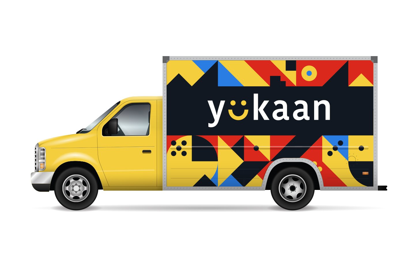
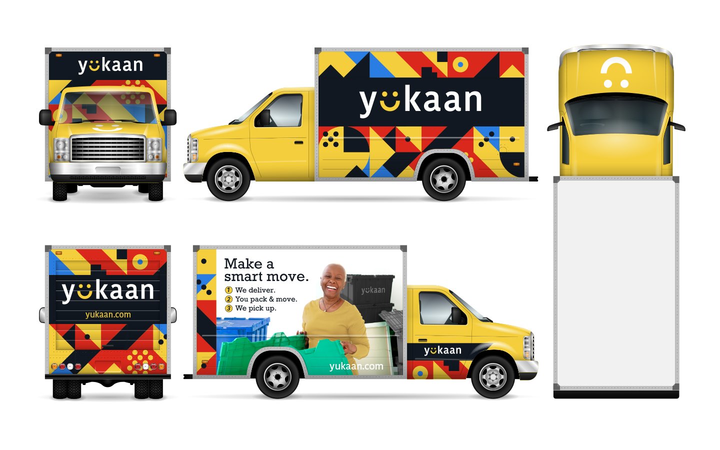
For curb appeal and to emphasize the color-coded bins, the delivery trucks were amped up in brand colors.

The first box a customer opens should ease the stress of moving. The Moving Day Survival Kit is filled with essentials: toilet paper, cleanser, paper towels—even some coasters for a well-deserved beer after a successful move.

Yükaan rents black, gray, blue, red, and green bins. Yellow “Golden Opportunity” bins were offered to movers, who would fill them with their unwanted belongings. Yükaan would take the bins to local charities, allowing movers to declutter while helping make a difference in the community.